Accessibility
The ALEX Design System is built on the principle that accessible design is good design, and therefore all of our products are compliant with the WCAG 2.1 AA Guidelines.
Before release, each product is thoroughly scrutinized to ensure that all users, regardless of their means of experiencing content, will not be excluded.
This guide isn’t a comprehensive list of all of the ways that we implement accessible design. There is a lot that goes under the hood with engineering (e.g. ARIA tags, semantic HTML structure, and screen reader testing), media production, and with the voice of ALEX. This guide serves to explain the ways that our interfaces accommodate users as inclusively as possible.
Color contrast
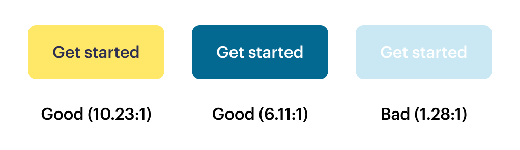
To have adequate color contrast, normal-sized text (defined as 18px and below) must have a contrast ratio of 4.5:1 of foreground color to background color. Large text is a little more lenient in WCAG 2.1’s AA standards, requiring 3:1. Despite this, we adhere to the 4.5:1 ratio for all text. Whether it’s large, small, label, button, inside of an input, or a link, it’s going to have a strong contrast ratio. This serves two purposes – it saves us time splitting hairs over what defines large and small text internally, and more importantly, it results in a more accessible experience for the user.
Typography
Our brand fonts, Graphik and Gelica, have been selected for their readability. They both come in a useful variety of weights, and all of their weights have distinctive and readable characters, enhanced by large, clear negative spaces within the glyphs.
Per WCAG 2.1 AA guidelines, the base body font is set at 16px for paragraph text, and is never smaller than 12px. Line-height on body paragraphs is set at 1.6x the font size, which satisfies the requirement of being at least 1.5x. And space in between paragraphs is set to be twice the height of the text.
For more specifics on typographic spacing, sizing, and colors, check out the typography standards section.
Buttons & links
Buttons
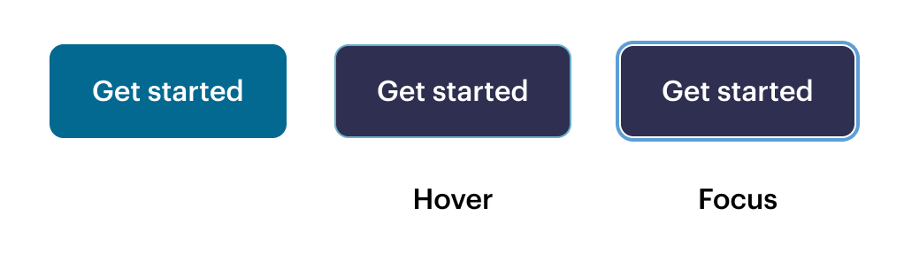
All buttons adhere to the color contrast standards and have a generously-sized clickable area. Buttons have a distinctive hover state, defined by a clearly differentiated background color. We use the browser-default outline for the focus/keyboard-only navigation state, since this approach has been vetted by each of the browsers we support, is contextually recognizable to users, and is visually cohesive with our other design standards.
Links
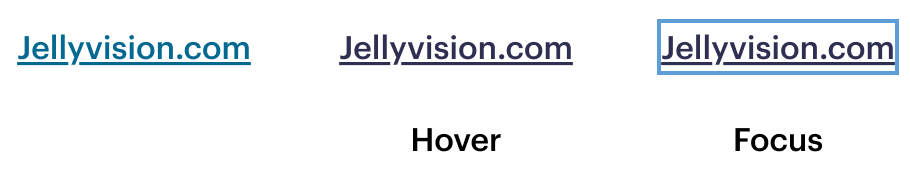
While links may not have the big comfortable clickable area of buttons, they are visually distinct from normal text. We use a thicker font weight and an underline to make inline links findable. The hover state follows the pattern of the primary button, darkening from Blue-800 to Ink-800. The focus state is further made visible by using the browser-default outline style.
Inputs
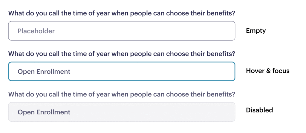
Inputs have an easily discoverable visual style, with a 1px Ink-800 border and larger-than-average clickable area. In the active/focus state, the border becomes 2px wide, and the blue color of the border becomes brighter. If the input is in an error state, the border becomes red to indicate that action is required, and this is always accompanied by an error message below the input to explain what action is required.
For a disabled input, this is indicated by a 1px pale gray border (which does meet contrast requirements) replacing the dark border. The input will not be selectable via mouse or keyboard, and if hovered, the cursor will indicate that it is not selectable.
Keyboard navigation
In Chrome, Safari, and Edge, our products are all keyboard navigable. All interactive elements have a visually distinct tab-focus state, and HTML is structured to ensure that keyboard-only navigation selects items in a logical order.
Captioning
All media in ALEX is captioned, so it’s understandable for viewers who need it—whether their sound off or don’t have access to sound. See the captioning guidelines for details on creating uniform captions.
Tools for checking accessibility
Deque AXE browser plugin is our preferred tool for testing and maintaining visual accessibility standards. It’s compatible with Chrome and Firefox, is free for the basic version, and provides a comprehensive report on any potential accessibility needs.